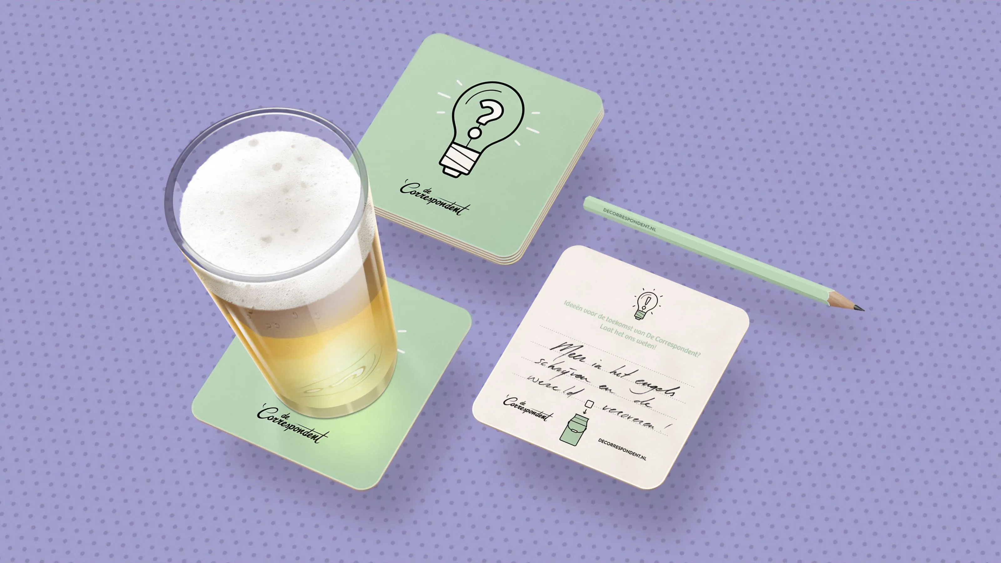
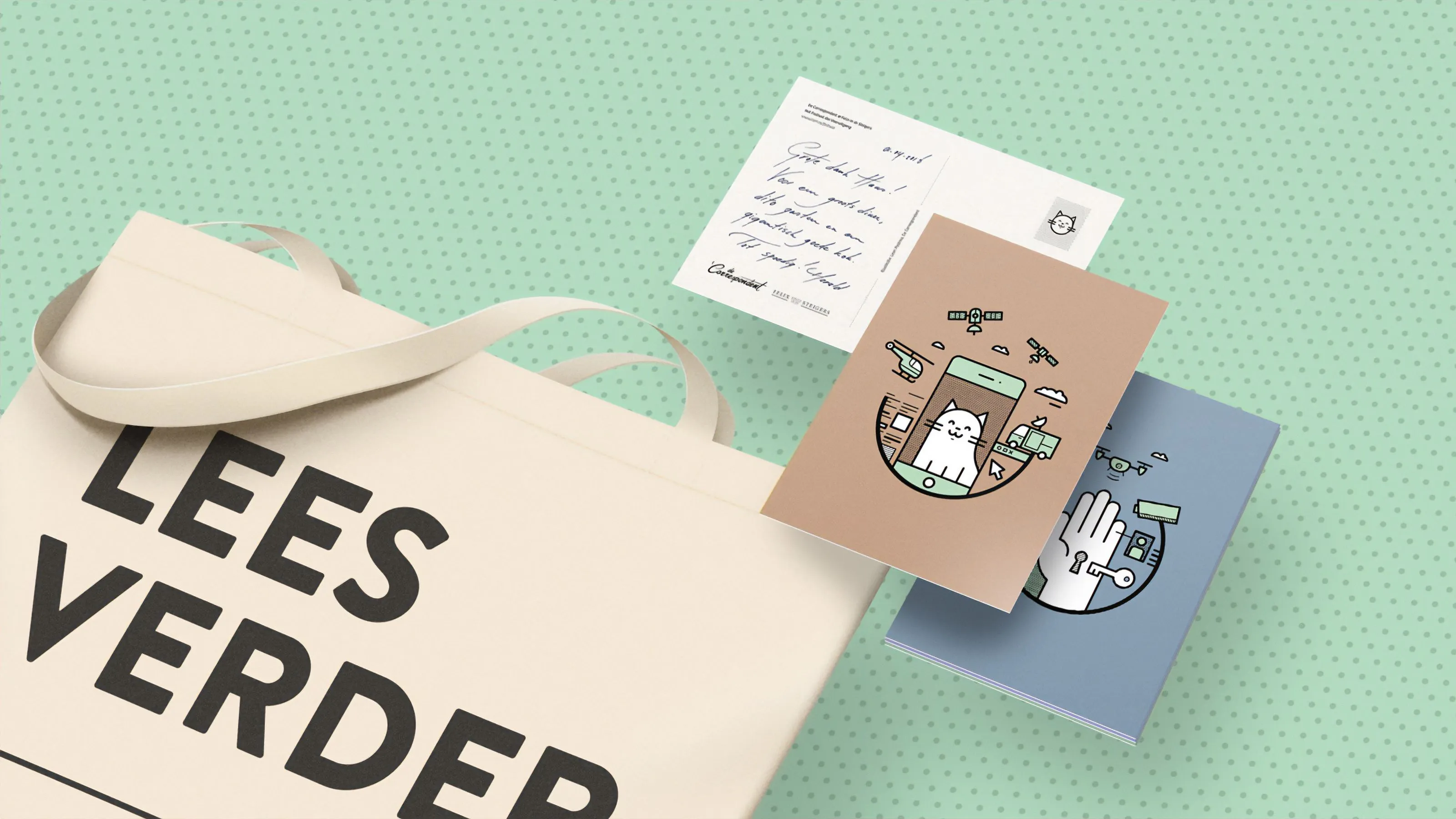
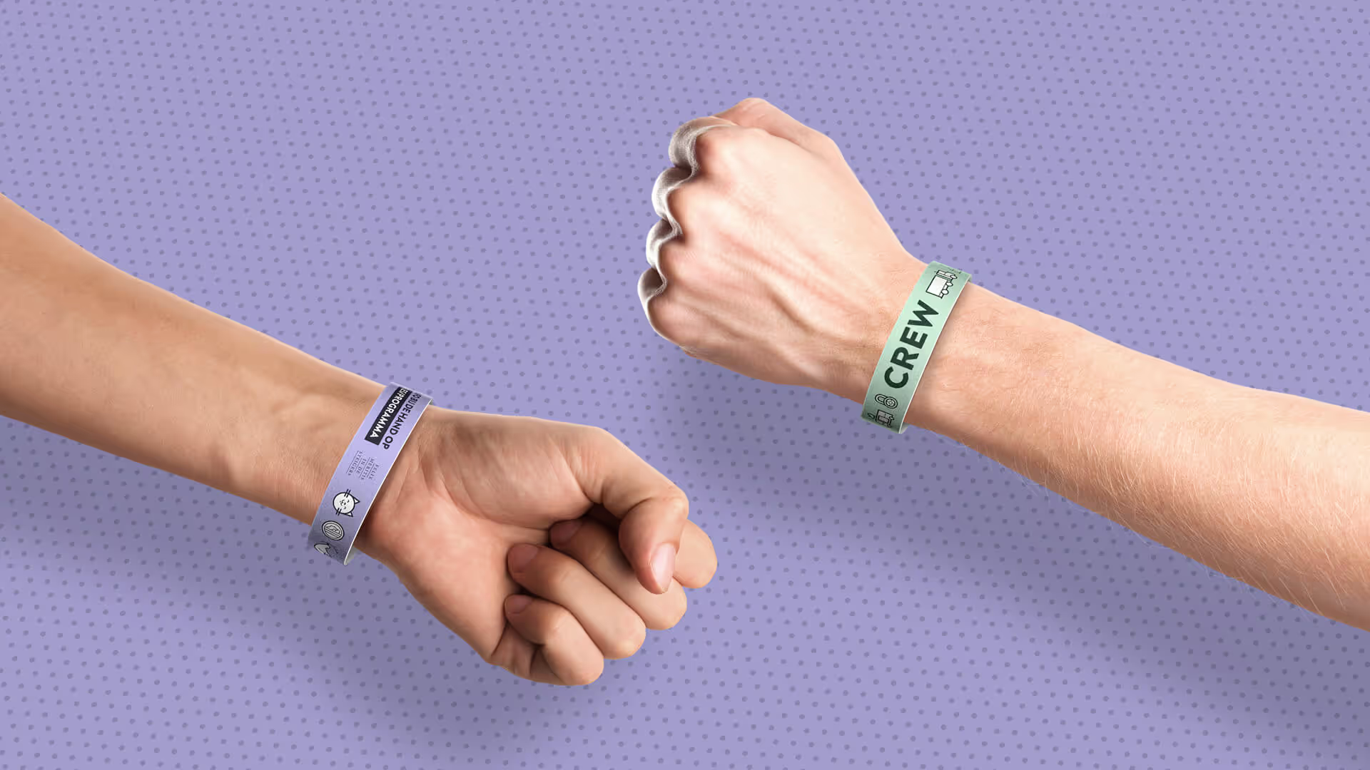
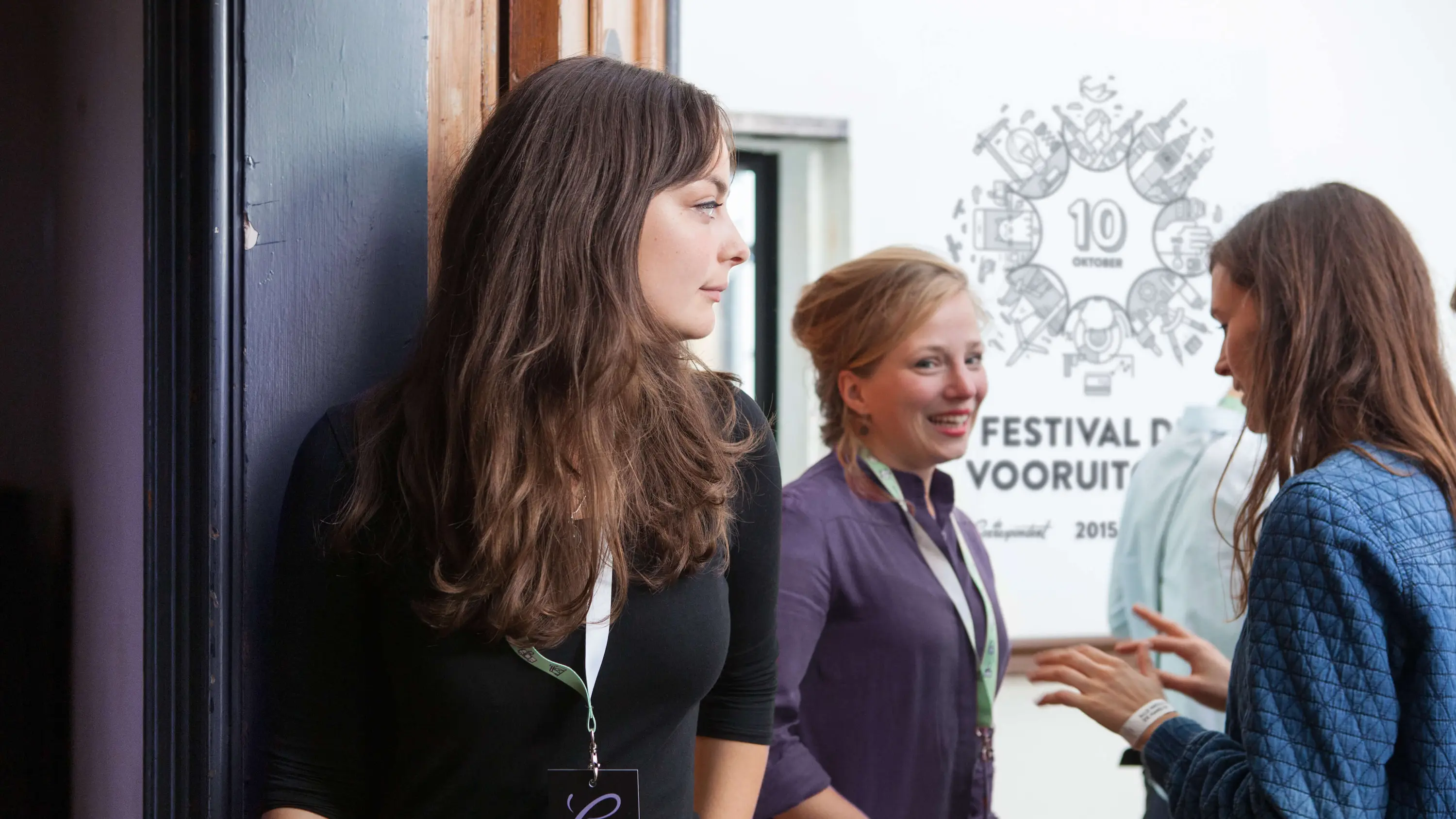
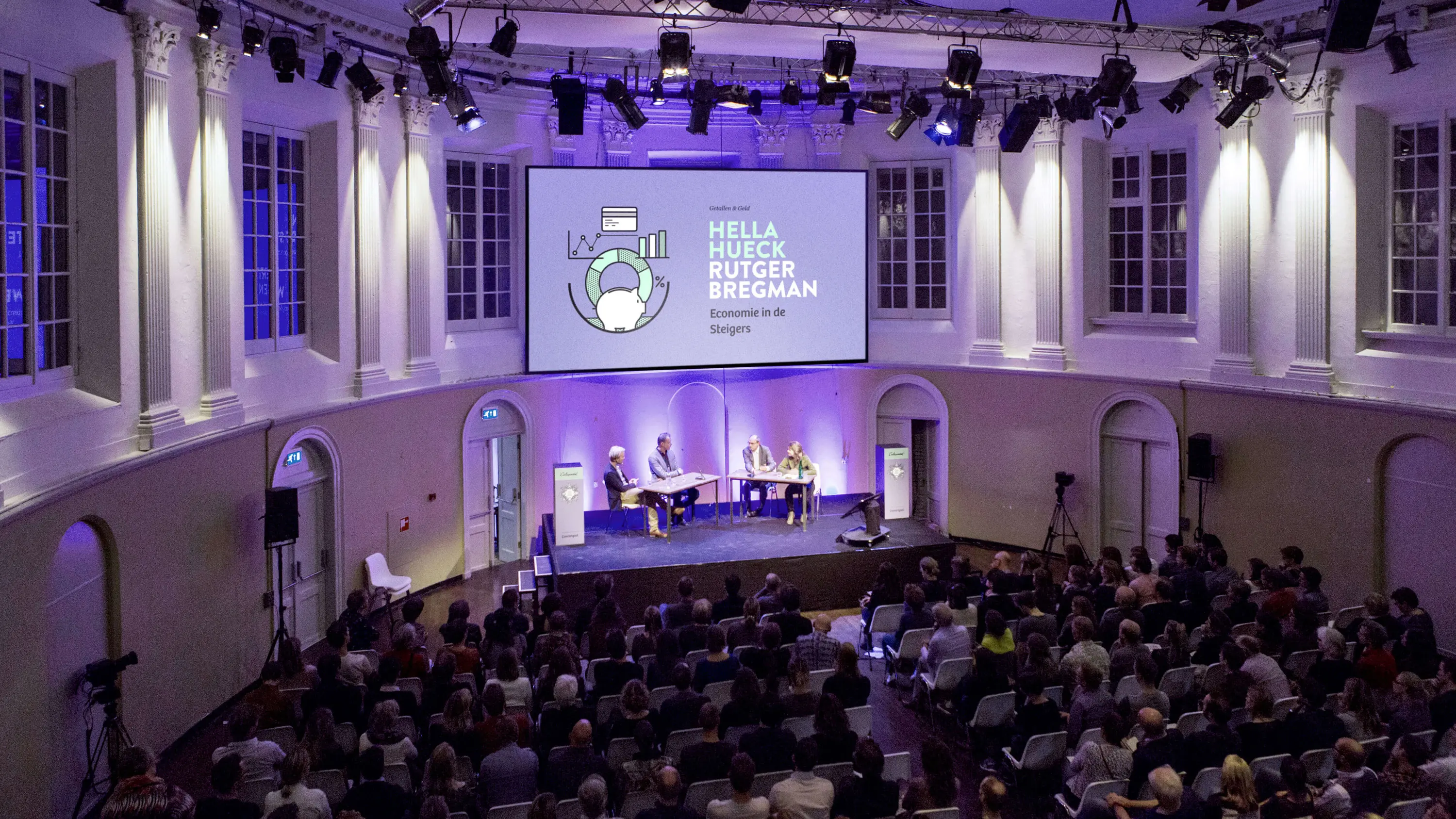
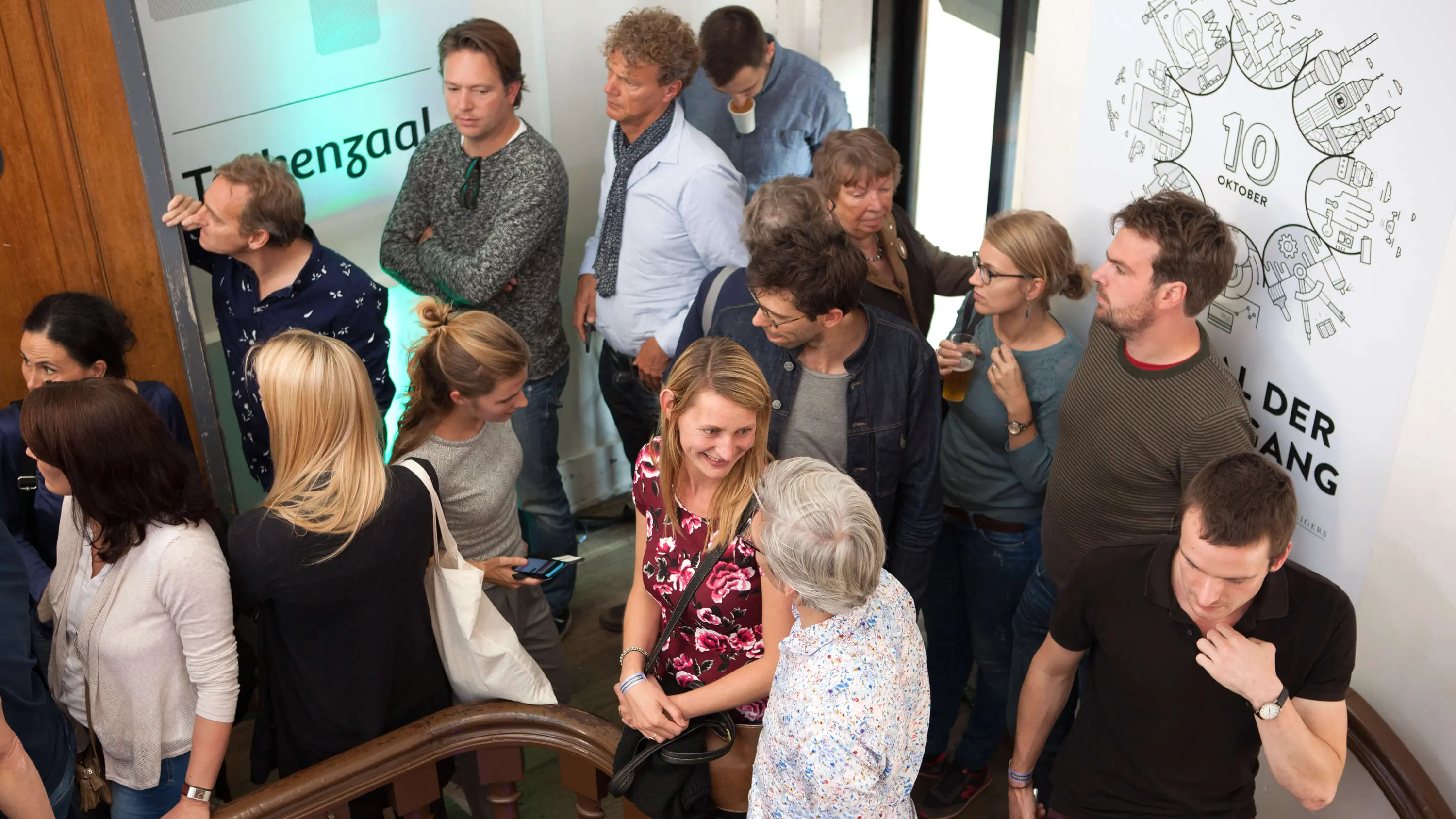
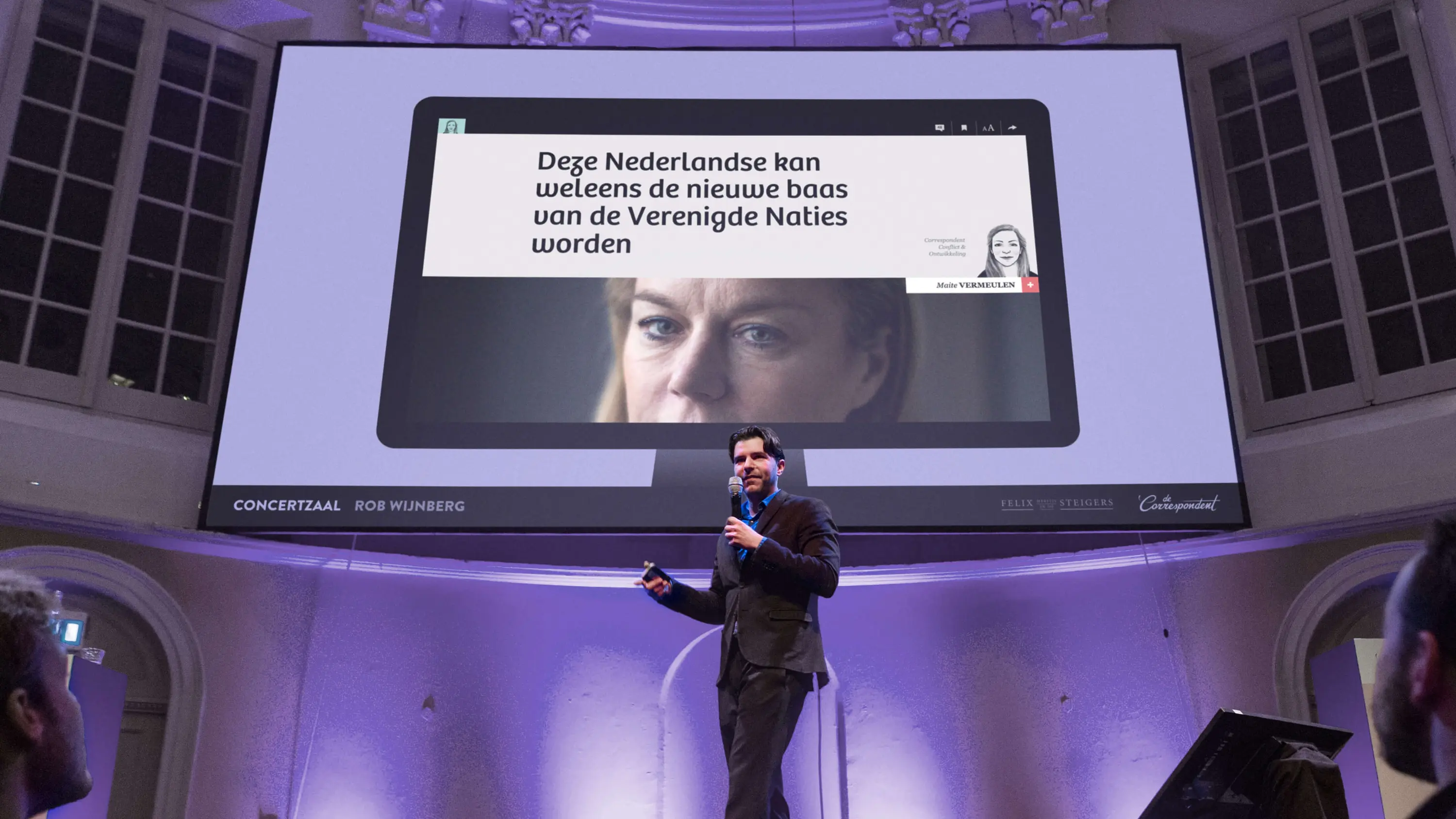
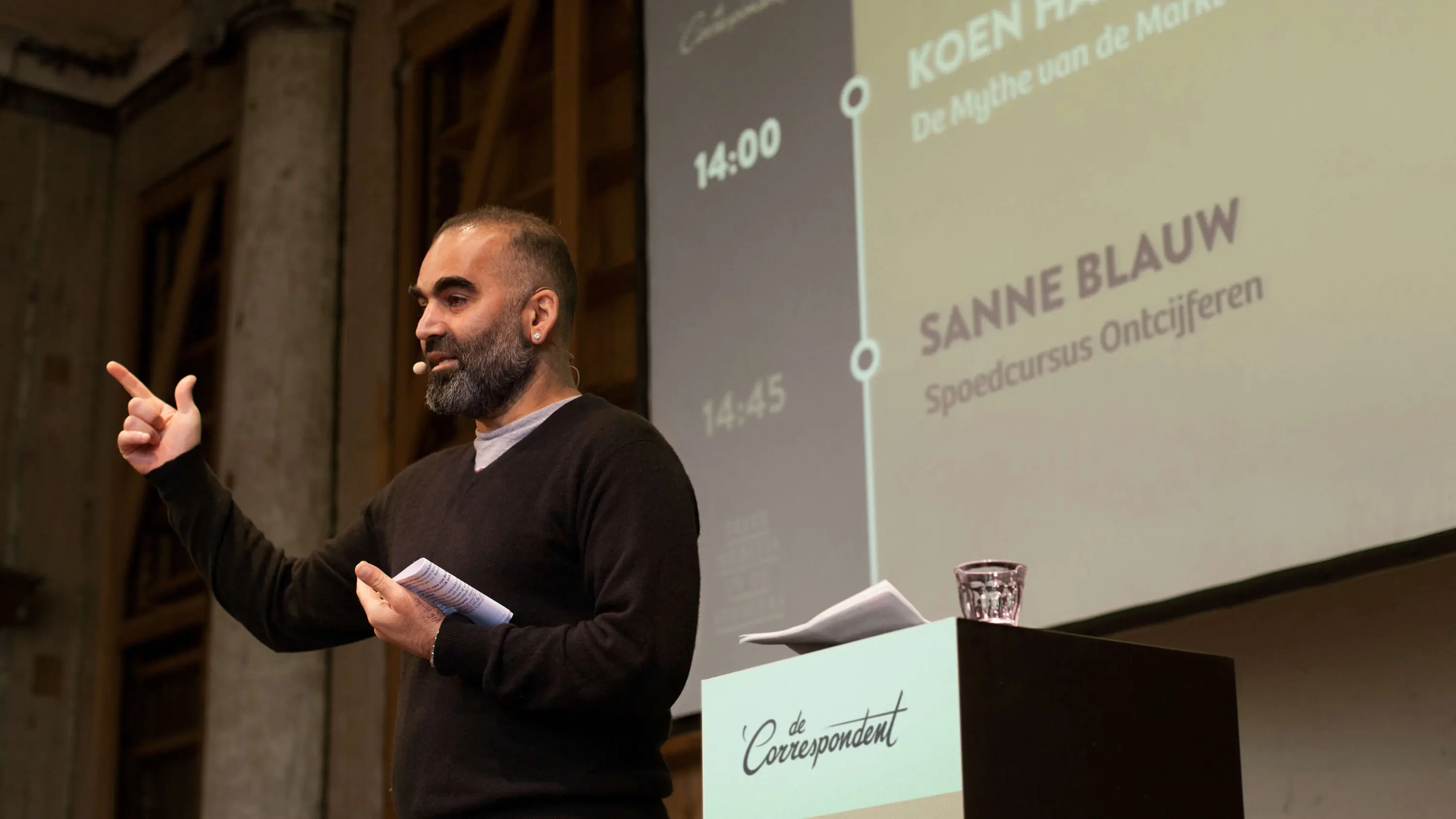
Momkai celebrated the second anniversary of its journalistic start-up, De Correspondent, with the Festival of Progress. It’s one of many events we’ve designed and art-directed for De Correspondent.
As co-founders of the online news platform, we aim to connect the digital to the physical, wristband to the website.
Events: a continuation of the user experience
Empowering our community of members means bringing a digital concept into the physical world. It means enabling our correspondents to act as conversation leaders and our audience to contribute in the real world just as they do online. To achieve this, we built event identities that tied the digital and physical together in a single experience.
The Festival of Progress
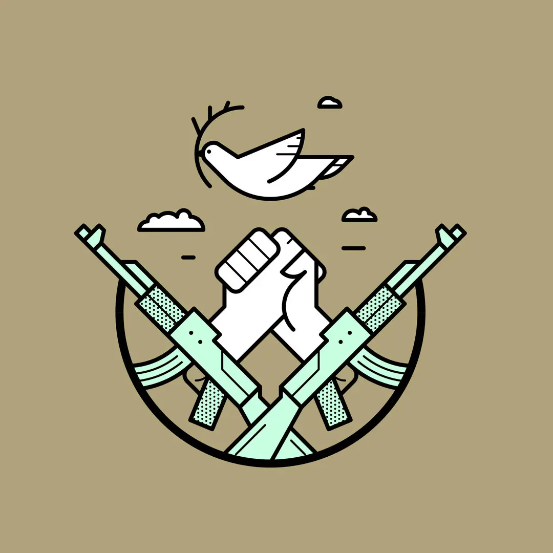
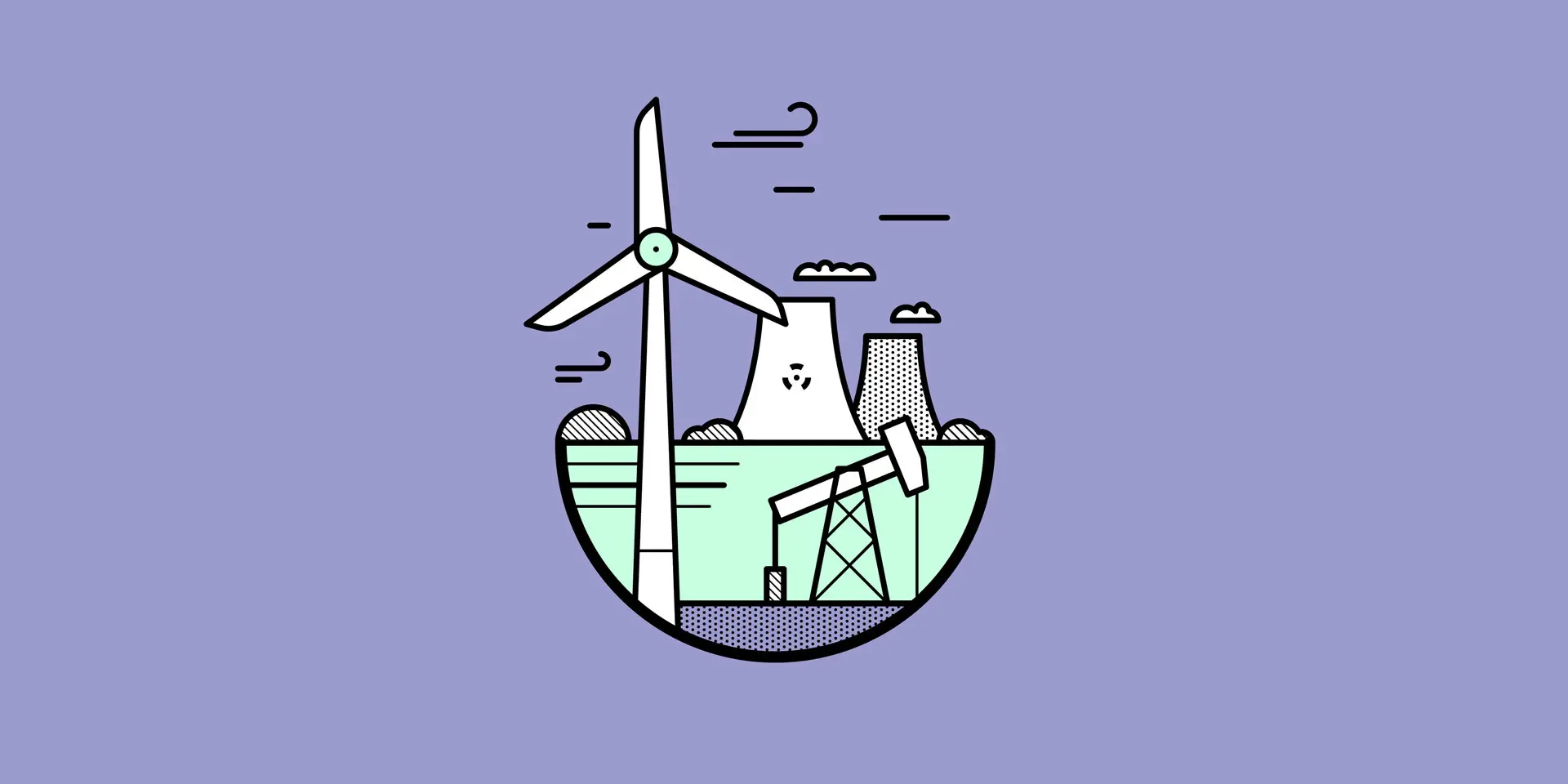
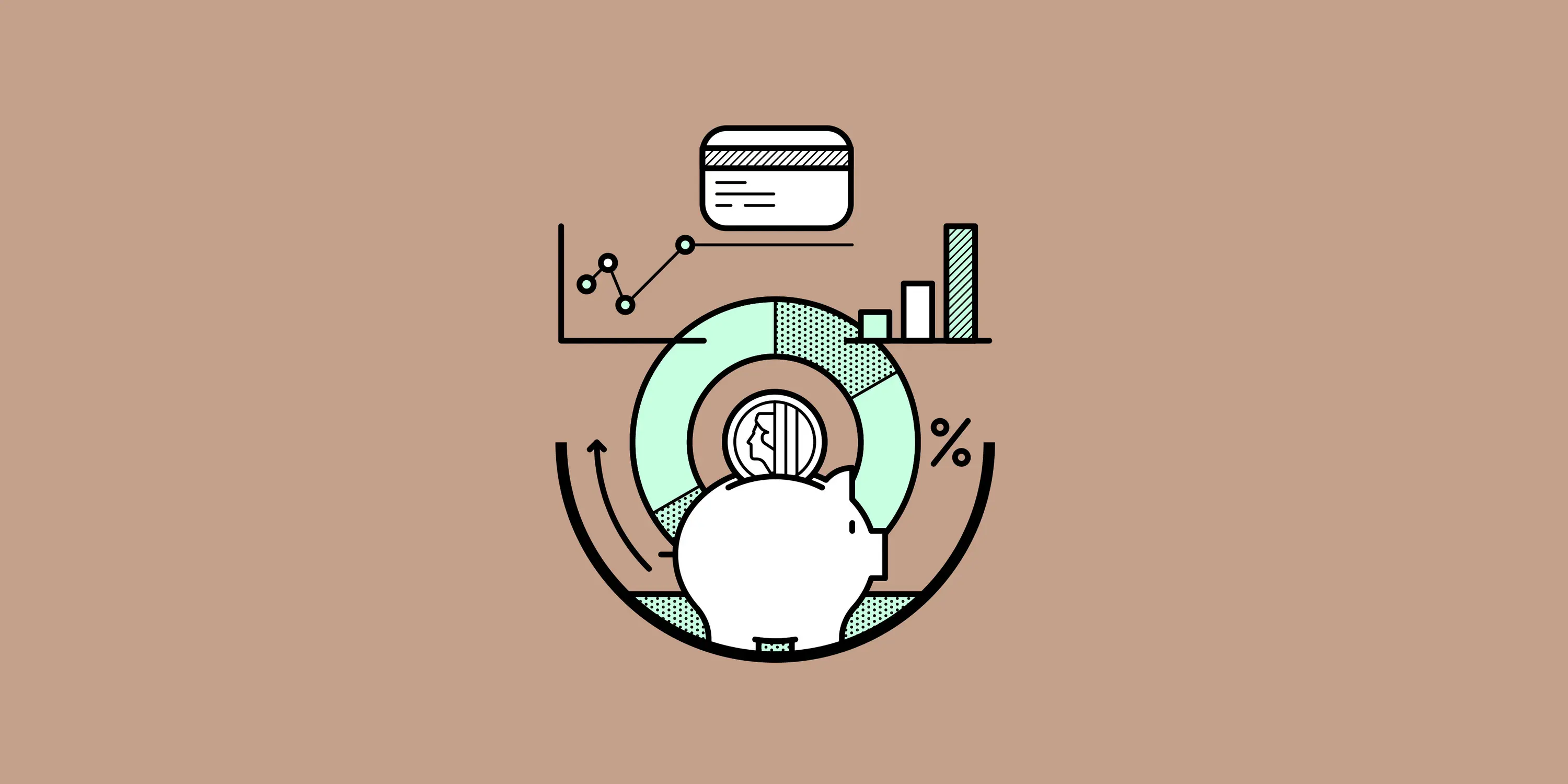
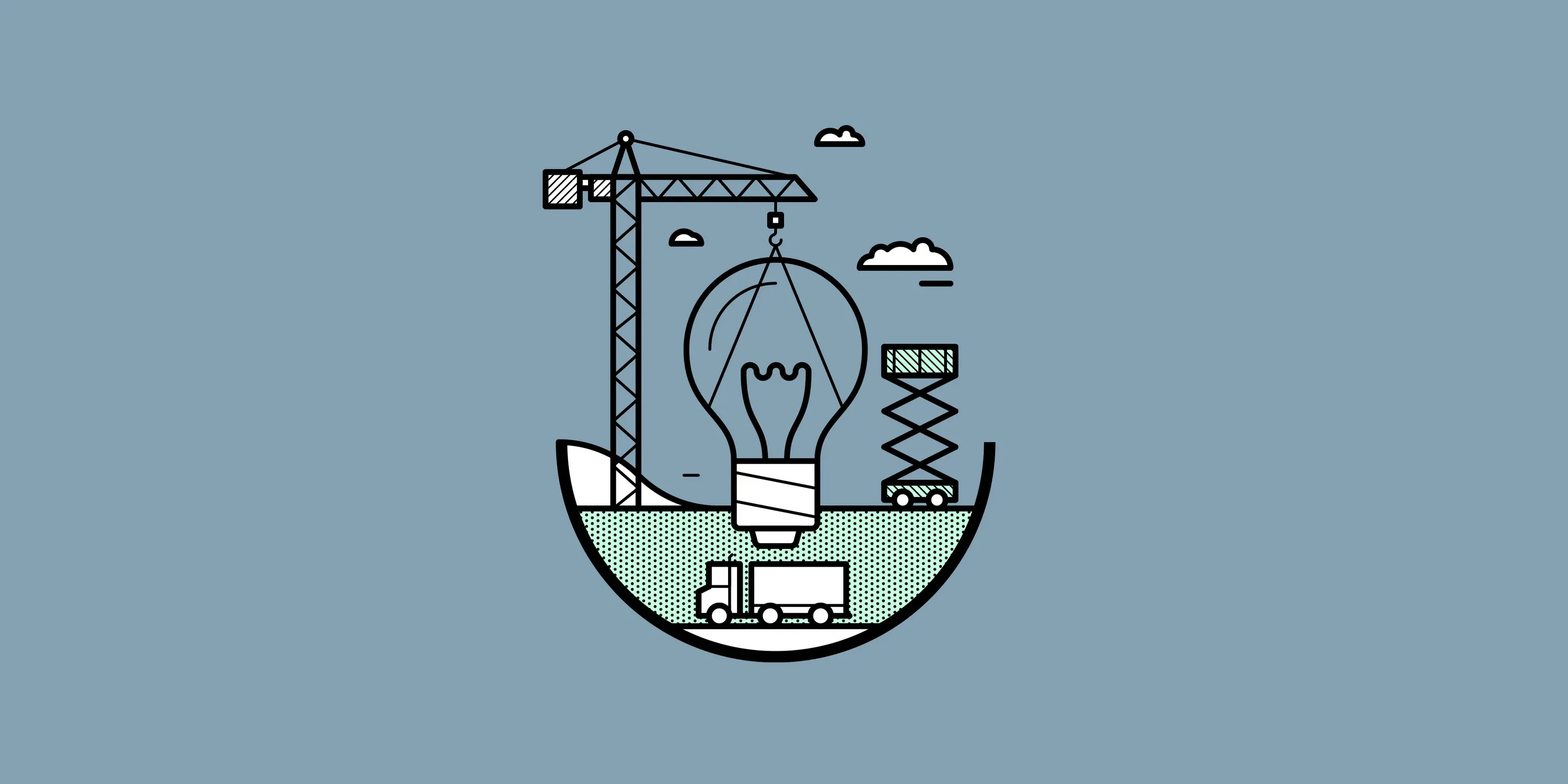
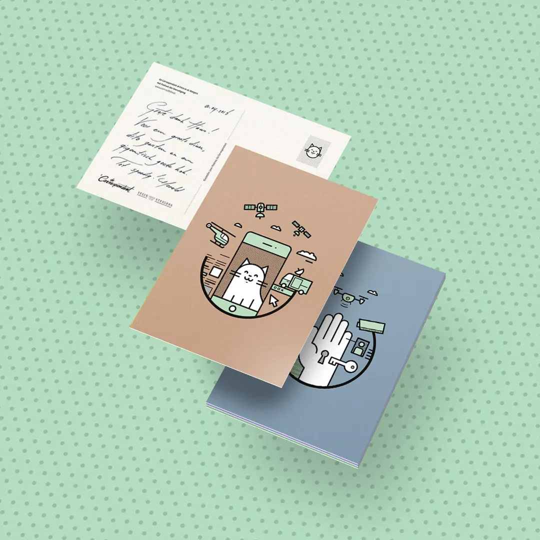
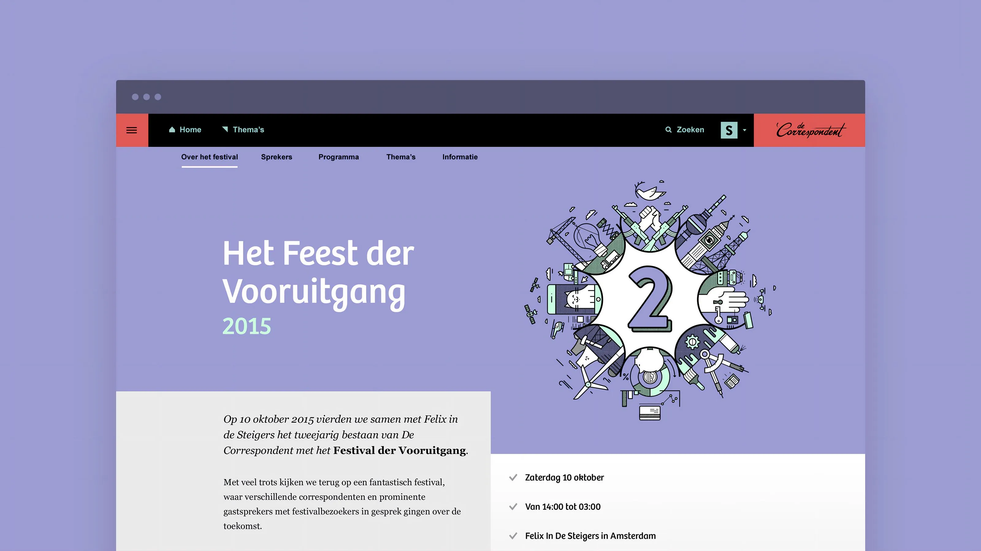
To capture the festival’s progressive nature, we created an unorthodox visual language. Its motion-driven style contrasted light-heartedly with the serious subjects at hand. The colour palette looked to the future, while retro references expressed the need for progress.
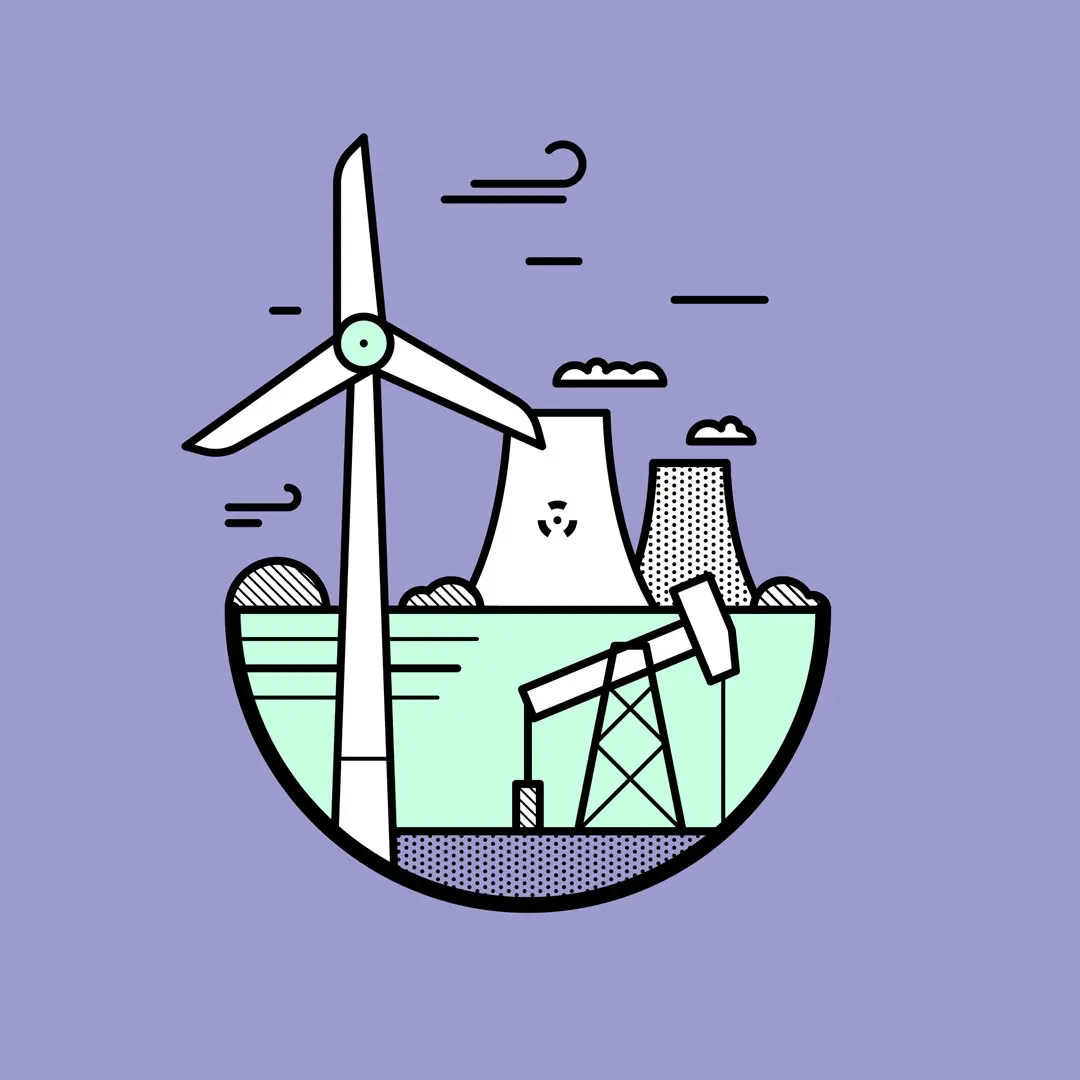
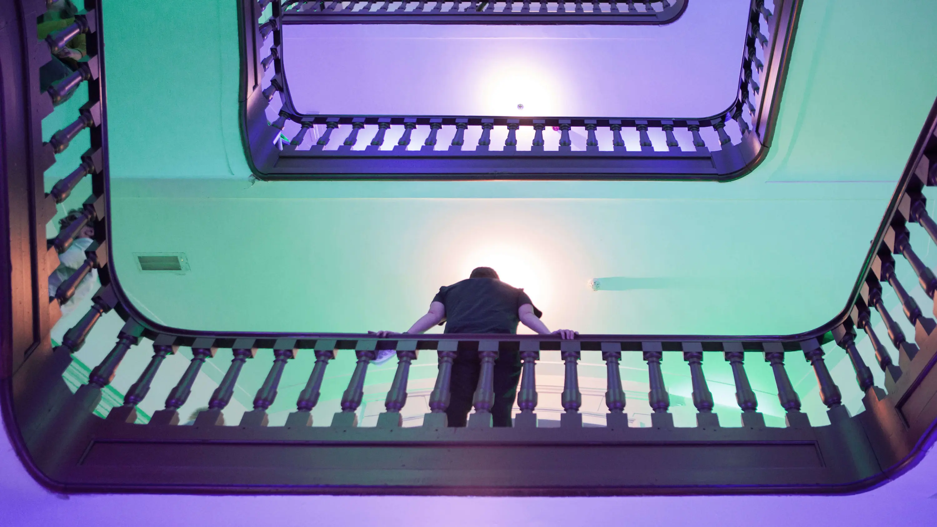
The festival’s themes were represented in looping animations. Their playful details – only noticeable over time – kept visitors visually interested until three in the morning. The animations combined to form the festival logo, presenting the future as a world full of opportunities.
Designing for consistency and clarity
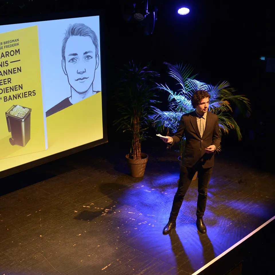
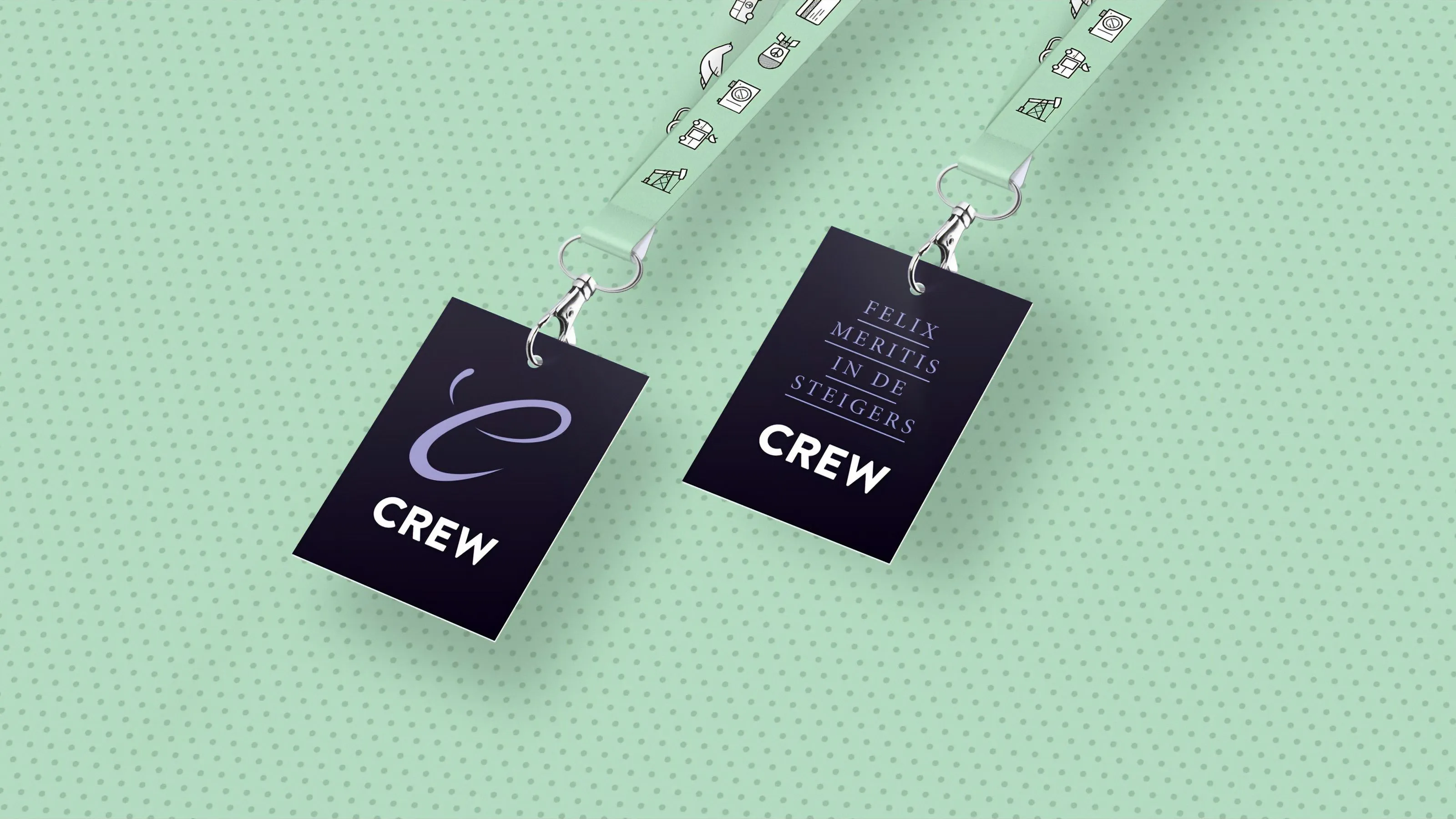
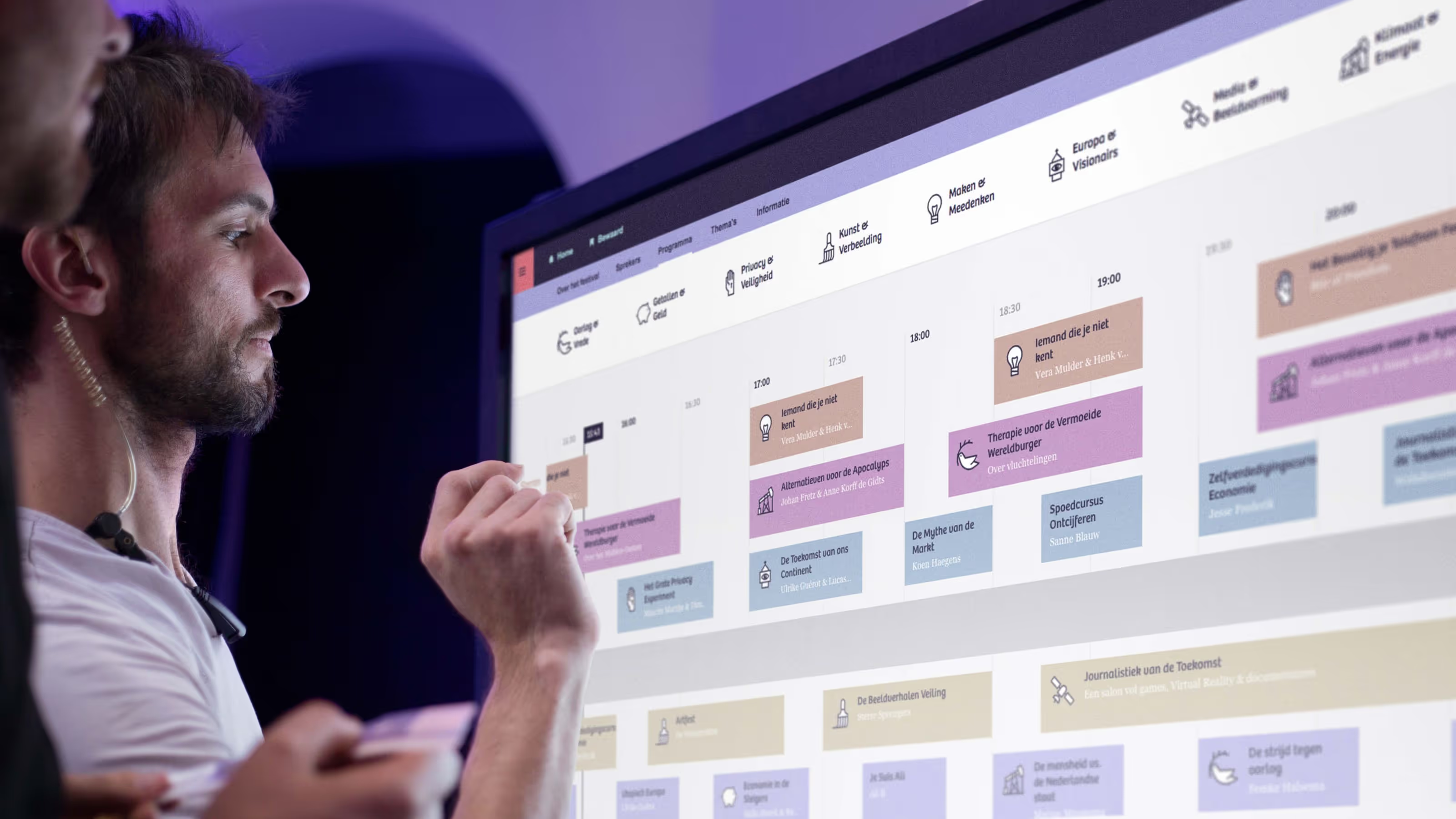
We go the extra mile for visual consistency, leaving no element – physical or digital – untouched. For the Festival of Progress, every speaker presentation, all signage, stages and lighting, and the website were created from one identity concept.
Our holistic approach brought a quintessentially digital platform into the physical realm and encouraged people to look toward a brighter future.

De Correspondent & Momkai
De Correspondent was co-founded by Momkai’s founder, Harald Dunnink, and its CTO, Sebastian Kersten, along with editor-in-chief Rob Wijnberg and publisher Ernst-Jan Pfauth.
Since its successful launch, which set a world record for journalism crowdfunding, the online platform has acquired over 60,000 members, who happily pay for quality investigative journalism.
Ready to grow your brandinto a movement?
Whether you’re launching or leveling up, we want to hear from you. Tell us about your challenge.


