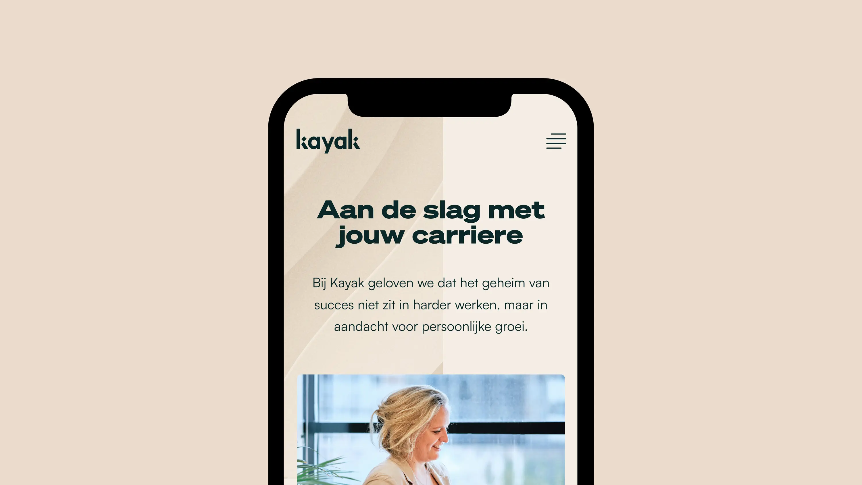
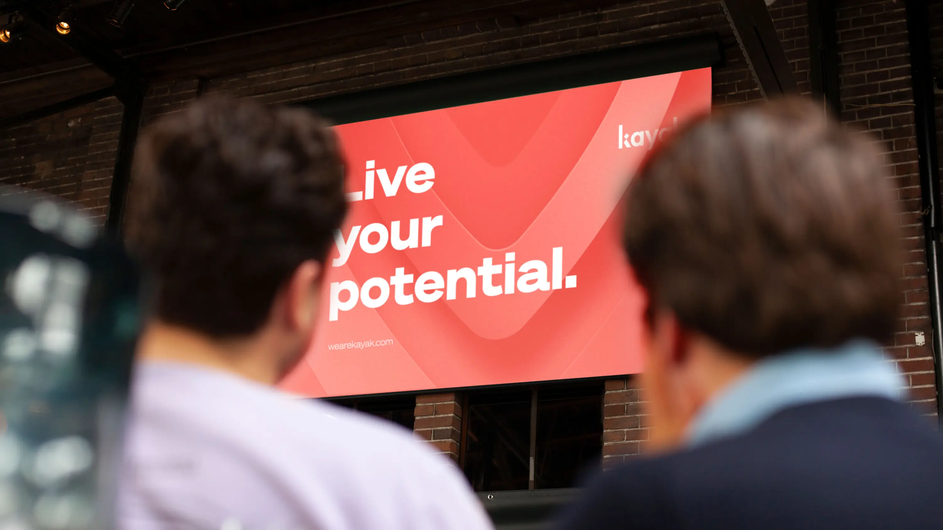
What happens when your mission has outgrown your brand identity? It’s time for a rebrand. When Kayak, a progressive staffing agency formerly known as Interim Valley, faced this problem, we were delighted to help out.
Together, we created a new name and visual identity, so their employees could unlock all of their own potential.
Creating a brand name that nods to longevity
The team at Kayak wanted their key audience, prospective talent, to see them as a long-term career move, not a short-term hop. Though their original name, Interim Valley, lasted them over a decade, it no longer reflected their mission to provide employees with opportunities for lasting personal development and growth.
We started off by identifying the many possible name directions that could align with their bold, progressive vision. After a number of brainstorming sessions, we landed on Kayak, a name that metaphorically sends you on a journey. When you travel in a kayak, you’re powered by your own strength and sheltered by a strong craft. That’s the relationship Kayak seeks to build with their employees.


Developing a color palette that cultivates calm
We were guided by Kayak’s nature-inspired brand identity when choosing their new color palette. We chose two distinct primary colors – ‘Pine’ and ‘Ember’ – which are complemented with a plain white canvas. To achieve a warm, human and calming effect, we used ‘Warm Beach’ as a secondary color. This tone was meant to have a supporting role in the color set, and round off the overall balanced design.


A visual language with impact
Creating a flexible and effective visual language was next. We pulled from our existing brand references and created elements that reflect the ripple a kayak can create by moving through the water.
These elements also refer to the ripple effect, the idea that every action we take can have an outsized impact on the world around us. While our team worked on the visual identity and rebranding, our friends at Jungle Minds developed the website.


Kayak & Momkai
Kayak is a recruiting agency that operates in the financial sector and helps match businesses with industry professionals.
At Momkai, we were proud to help the Kayak team throughout their rebrand journey to create a new identity that better reflects Kayak’s mission.
Bold ideas need steady hands.
Whether you’re just launching or ready to scale up. We help you hit the ground running.


